Appearance Settings
Configure the visual appearance of MindfulMedia including colors, typography, and image ratios.
Accessing Settings
Go to MindfulMedia → Settings → Appearance
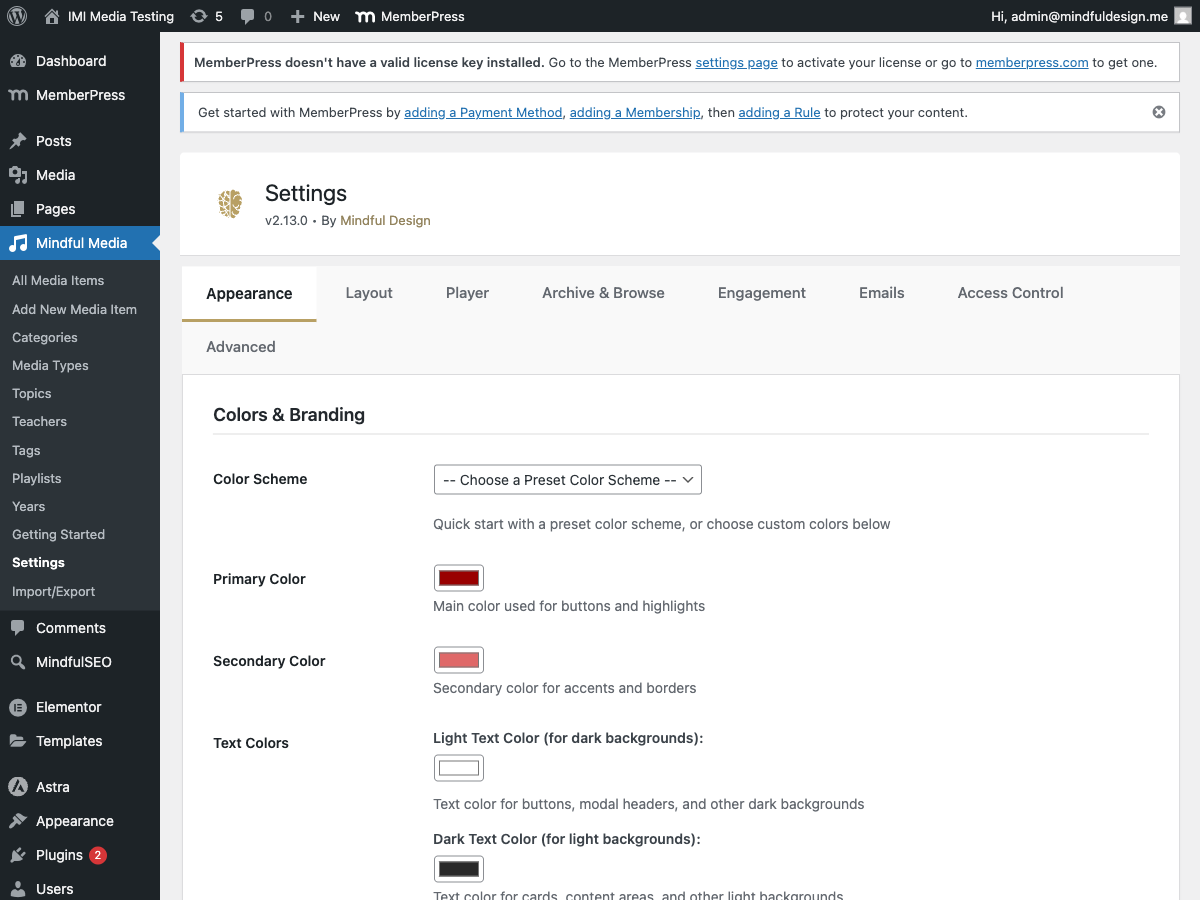
Colors & Branding
Primary Colors
| Setting | Default | Description |
|---|---|---|
| Primary Color | #8B0000 |
Main brand color (buttons, links, accents) |
| Secondary Color | #DAA520 |
Secondary accent color |
| Text Light | #FFFFFF |
Light text on dark backgrounds |
| Text Dark | #333333 |
Dark text on light backgrounds |
Badge Colors
| Setting | Default | Description |
|---|---|---|
| Audio Badge | #D4AF37 |
Background for audio type badges |
| Video Badge | #8B0000 |
Background for video type badges |
Player Colors
| Setting | Default | Description |
|---|---|---|
| Progress Bar | #ff0000 |
Video progress/scrubber color |
Typography
Font Selection
| Setting | Options |
|---|---|
| Heading Font | System fonts or Google Fonts |
| Body Font | System fonts or Google Fonts |
System Fonts
- System UI
- Arial
- Helvetica
- Georgia
- Times New Roman
Google Fonts
Popular options included:
- Inter
- Roboto
- Open Sans
- Lato
- Poppins
- Montserrat
Usage
Fonts apply to:
- Media titles
- Descriptions
- Navigation
- All plugin UI elements
Image Ratios
Control the aspect ratio of images for each taxonomy type.
Per-Taxonomy Settings
| Taxonomy | Default | Options |
|---|---|---|
| Teachers | Landscape | Square, Landscape, Portrait, Custom |
| Topics | Landscape | Square, Landscape, Portrait, Custom |
| Categories | Landscape | Square, Landscape, Portrait, Custom |
| Playlists | Landscape | Square, Landscape, Portrait, Custom |
Ratio Options
| Option | Ratio | Best For |
|---|---|---|
| Square | 1:1 | Profile photos, icons |
| Landscape | 16:9 | Video thumbnails |
| Portrait | 3:4 | Book covers, posters |
| Custom | User-defined | Specific requirements |
Custom Ratio
Enter in width:height format:
4:3- Classic TV ratio21:9- Ultrawide1:1- Perfect square
Where Applied
Ratios affect:
- Browse page cards
- Archive grid thumbnails
- Modal sidebar items
- Taxonomy archive pages
CSS Variables
All colors become CSS variables for consistent theming:
:root {
    --mindful-media-primary: #8B0000;
    --mindful-media-secondary: #DAA520;
    --mindful-media-text-light: #FFFFFF;
    --mindful-media-text-dark: #333333;
    --mindful-media-progress-color: #ff0000;
}
Preview
Changes are visible immediately after saving.
Testing Colors
- Change a color
- Save settings
- View the browse page or archive
- Verify colors applied correctly
Best Practices
Color Harmony
- Choose complementary primary/secondary colors
- Ensure sufficient contrast for accessibility
- Test on both light and dark backgrounds
Font Pairing
- Use one font for headings, one for body
- Ensure readability at small sizes
- Test with long titles
Image Ratios
- Use consistent ratios within categories
- Square works well for profile-style content (teachers)
- Landscape works well for video content